Category: Design

  • Time to learn how to model in 3D

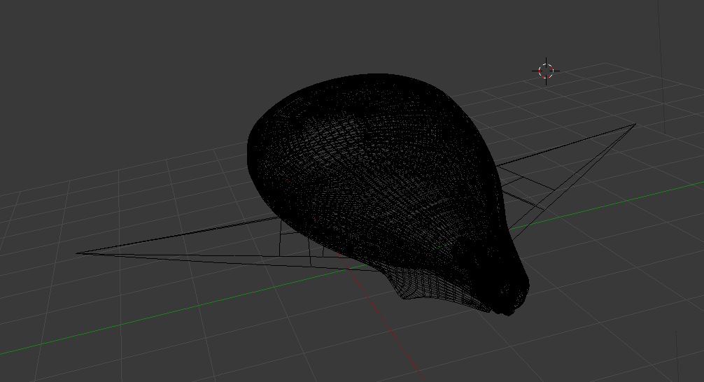
    I started up a game studio with a good friend last year, and we’re set to release our first game in the next few weeks. To create hype for the new release, I wanted to create some promotional items to send out to media websites, friends and family. What started off as a sketch not unlike most of my projects, quickly turned into me downloading blender 3D and hitting YouTube for beginner tutorials. I dabbled with 3D back in school but it was only for one semester, and unfortunately back several years ago it just didn’t have the same appeal to me as it does today. With new renderers, software, and cool ways to show off your creations; I set off to join the masses to create cool 3D imagery. I started off with a base model, did some extrusions and formed the shape of the ship from our game. Some subdivision masks, and a LOT of patience later left me with a smooth version. From there I learned about UV unwrapping and texturing, lighting and finally – rendering.

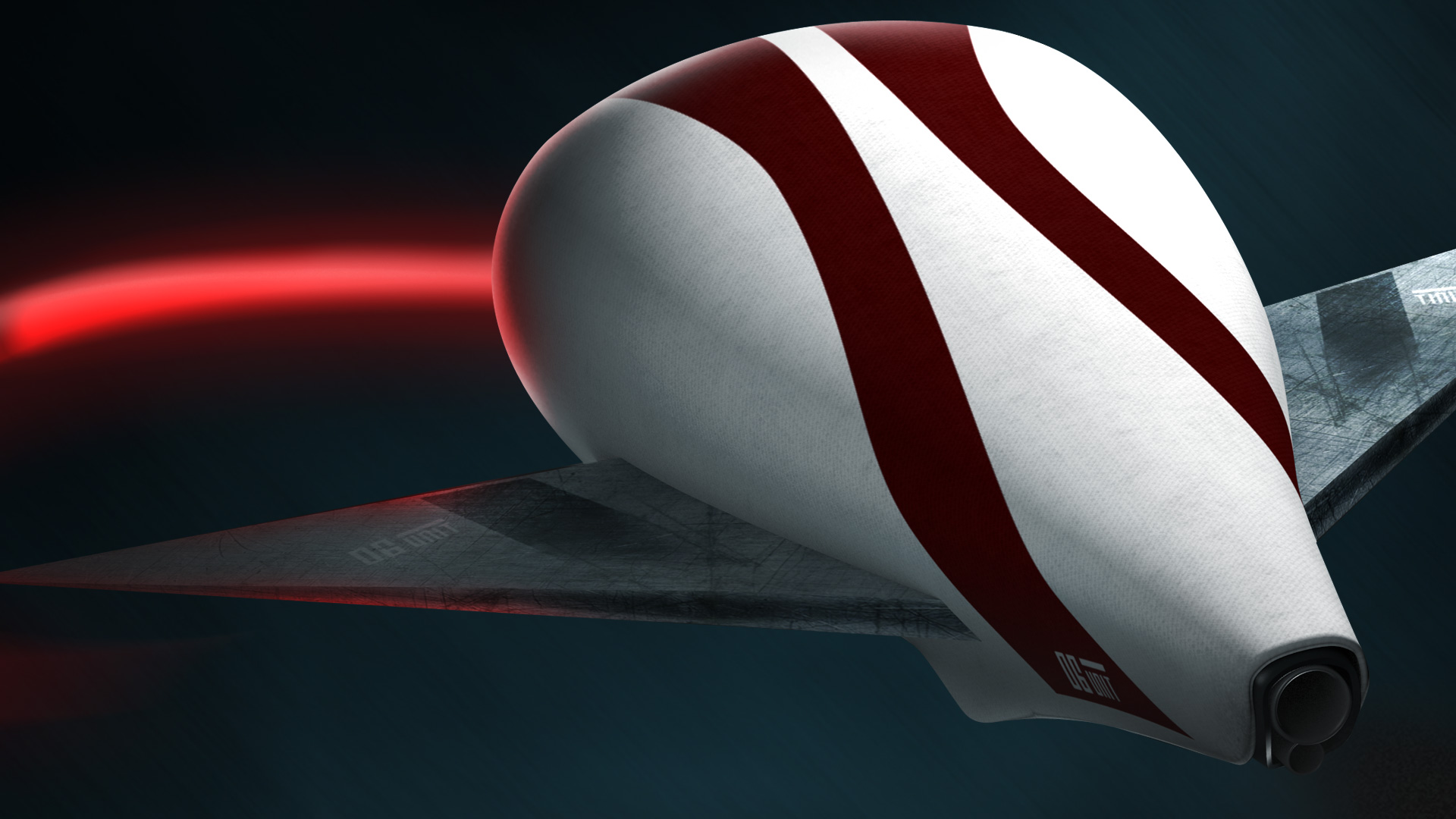
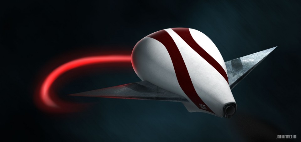
    Here’s the model I rendered in Blender 3d from scratch. I then brought it into photoshop and added some fancy magic with the red whip and highlight effects. Pretty cool for only 2 weeks of very sparse tutorials, and 30 minute at-a-time spurts of work!


    3d shwip


    From now on I think I’ll one way or another incorporate 3D into my future projects. Perhaps I use them for some cool 3D icons, or maybe some nice text to help stand out from the rest. It’s incredibly easy to learn 3d in my eyes, and youtube and other various resources really made it easy for me to stay interested.

    3d wireframe of our ship


    shwip details

  • What being a hybrid designer has taught me

    I was the kid growing up who took everything apart and wondered how it ticked. I’ve always had an insatiable desire to figure out how something works. I remember first learning how a manual transmission worked after watching my dad drive for years and years. Once I learned about flywheels and clutches, I instantly gained a respect for the engineering that went into every car. I played primarily with Lego and reclaimed parkay flooring as a child with my older brother. We would construct vast structures out the wooden blocks which would later include a cathedral, various other buildings and a bridge that spanned both our sofas. Littered on the bridge were toy cars and lego vehicles we managed to build out of nothing but pure imagination.

    Fast forward a couple of years and I began learning about design and photography. Aperture, ISO, shutter speeds, typography, colour theory and the grid were my next adventures. I learned about the rule of thirds, exposure; and, how to compose a photo in a way that told a story. Much was the same when it came to designing websites. I loaded up IE 6’s source code viewer and began my journey into front end development. Back when I started learning these techniques, Iframes were popular and Google was just beginning to gain traction. There were no guides on how to build a website, you had to go to school to do it. I learned how to build a site by de-constructing my favourites.

    From there, I learned to respect the medium and how to exploit it in order to get the best designs on the net. Photoshop can do great things, but they didn’t necessarily transfer over to browsers 5-10 years ago. I learned that in order to be a better designer for the web, my experience with how to actually build the site came into play when I made executive design decisions. Today, the lines are blurred since browsers have caught up and now allow us designers to go nuts with our work. Webfonts, transparency, css3, and html5 are amazing tools that I am so grateful to have access to nowadays.

  • My print debut in The Web Designer’s Idea Book.

    I’m happy to announce that my site has been added to Patrick McNeil’s most recent book: “The Web designer’s Ideabook vol. 3!”  I’ve updated the site a bit over the past year, but the general look and feel remains the same. I’m listed under the Cufon section of the book. Unfortunately, I moved to webfonts about a year ago to decrease load times. Thanks again Patrick for choosing my site!

    mrbavabook

  • Subtle 3D

    I love to implement 3d into some of my designs. Here’s a small showcase of some recent projects.

    3dSoap
    A simple logo for Soap News on Globaltv.com. I employed a really easy gradient technique and a soft backend shadow to give the impression of depth.
    dpad
    Test logo for a member on a forum. Showcasing the power of subtle and easy photoshop layer effects and dropshadows.
    I spoon nutella tshirt
    The graphic I created for my Nutella t-shirt, I made it float to look cool.
    gtv
    The dropshadow underneath the main navigation, cool and clean – with a not so in-your-face shadow.
  • Survivor Infographic

    The content team at GlobalTV.com asked me to create an infographic for their upcoming season of Survivor, entitled Survivor: Caramoan. Looking over a few important details, I researched past Survivor seasons and put together a working package of themes and visuals. Have a look and read the article, linked here.

    Survivor Infographic
    The header image of the Infographic. I extracted the base logo from previous seasons and added a 3d effect in illustrator, and then added the wood texture to give it more oompfh.
    The middle section of the graphic gives readers info about the odds of becoming a survivor on the show. I sourced some high res wood textures and burned them into the wood to give it a more authentic look. The fabric plates use the look and feel from several props on the show, including the hand created torches.
    The middle section of the graphic gives readers info about the odds of becoming a survivor on the show. I sourced some high res wood textures and burned them into the wood to give it a more authentic look. The fabric plates use the look and feel from several props on the show, including the hand created torches.
    The final section of the site shows a call to action to get readers to interact with the article and potentially win a prize. Wood textures, obviously an important theme here played a role in rounding out the look and feel of the graphic.

    See the full image and read the article here.


  • Should every web designer know how to build the sites they design?

    I feel that if you are a web designer you should know at least the basics of html and css in order to build what you’ve designed. This way, you fundamentally understand how a site is built from the ground up and can appreciate the inner workings of front end design. I’ve had arguments that go both ways, and they usually end up with someone feeling insulted.

    Personally, I take a front end design path when creating a new website. Firstly, I create the brand and two versions in photoshop – the desktop and the mobile versions. I then start coding my framework and css and begin sending my clients the progress. I let them know it is a work in progress and they understand, barring I explain in detail why something hasn’t been implemented yet. I find it incredibly arduous to create multiple photoshop documents for one site and often hear designers complain about such a task. Smart objects were introduced a few Photoshop versions ago and should be used in everyone’s daily workflow. Despite some shortcomings, they make reusing assets within one document incredibly easy and efficient.

    When I say that all designers should know how to build the site they design, I come from when I was looking into becoming an architect. I thought being an architect back in my naive days was just to draw fancy looking buildings, and then have them magically appear. What I learned was that architects are basically artistic engineers, and they need to know the physics and math in order to design something that won’t kill everyone inside OR defy the laws of physics. My point is that they understand the medium they are designing for and understand what makes things tick.

    This line of thinking can relate to front end developers with no skills in design. Often my designs are not cut out right, and look quite different to what I mocked up in photoshop. Someone recently said to me that it’s very uncommon for a final design to look identical to photoshop in a browser. I disagree in that I hope that front end developers use those mockups as a perfect representation of what should be on the final screen. If front end developers learn how to properly dissect a psd file, I believe our woes will dwindle, and; most importantly  our sites will look great when multiple people are working on them.

    We all need to take steps to learn one anothers crafts in order to have the best of design and code out there.

  • Love nutella as much as I do? Show it off!

    I created this graphic a while ago for my love of Nutella. Let everyone around you know it too, they might even have a story to share. mrbava_store_tshirt

  • How to get pixel perfect shapes in photoshop

    Creating vector shapes in Photoshop is a pain when you need pixel accuracy. Photoshop anti-alises the shapes the same way it does for text. Fortunately you can edit the grid and snapping so you can achieve pixel perfect shapes every time and leave those blurry boxes behind.

    Hit ctrk+k or command-k and head on over to your guides, grids and slices tab. Change your settings to match the following image.

    Hit ctrl-‘ or command-‘ to bring up the pixel grid, and make sure you enable snapping in the view tab.

    You’ll then be able to go from creating shapes that are both crisp, and aliasing free. Perfect for grids and image based layouts ; and, leave messes like this in the past.

  • New king is in town

    It’s no secret that I’m a massive Nutella fan. Sure it’s loaded with sugar and unnecessary fat, but It’s been a part of my life since I was a little kid. I’ve always loved peanut butter and jam, but since my grandmother crafted a bagel with Nutella and peanut butter many moons ago, I just can’t be part of the PBNJ crown any longer. Alas, enjoy this graphic,Print it, love it and share it with your friends!

  • What I want from photoshop cs6

    Adobe seems to like adding in features to attract those who don’t really need the full power and toolkit of Photoshop. Here are some of my suggestions from someone who has the program open all day.

    1. Dynamically fed text areas – txt files, docs, web links, etc!
    2. Text areas with floating functions like inDesign, so I can format my text with shapes, etc.
    3. Dynamically expanding shapes, so I can create responsive design templates, and export right from Photoshop to html
    4. Improved content aware and fill, bring back the pattern maker
    5. Built in paragraph controls, so I can create columns and other text effects
    6. Column templates, grid structures hardcoded
    7. These are what I can think of off the top of my head. As you can tell, I have many gripes with the way text is handled in Photoshop!