UX & Product Design > Scotiabank > Scotia AEM Design Library
A design guide built for content authors
Transitioning from traditional HTML and CSS to a modern component-based content management system not only enhanced our page design but also revolutionized the daily workflow for our content authors. This new approach streamlined the creation process, allowing authors to focus on delivering high-quality content without being bogged down by technical complexities.
My Role
Lead UX/UI Designer
The Team
1x Design, PM, BA
The Challenge
Our content authors are responsible for building hundreds of new pages per month while keeping a hefty list of over a thousand pages updated and complaint.
With the bank’s reputation on the line, it’s safe to say that these pages and the content within is very important to get right.
We found that content authors had a hard time juggling the design side with the content aspect of their workflow, so we set out to build and design a guide to help them focus on their most important tasks.
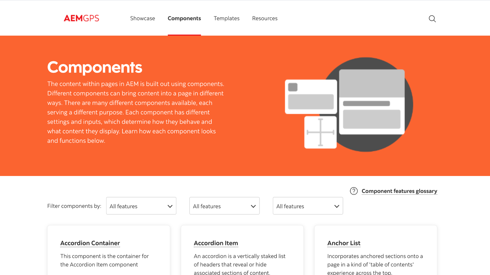
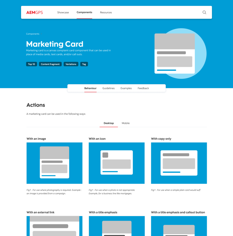
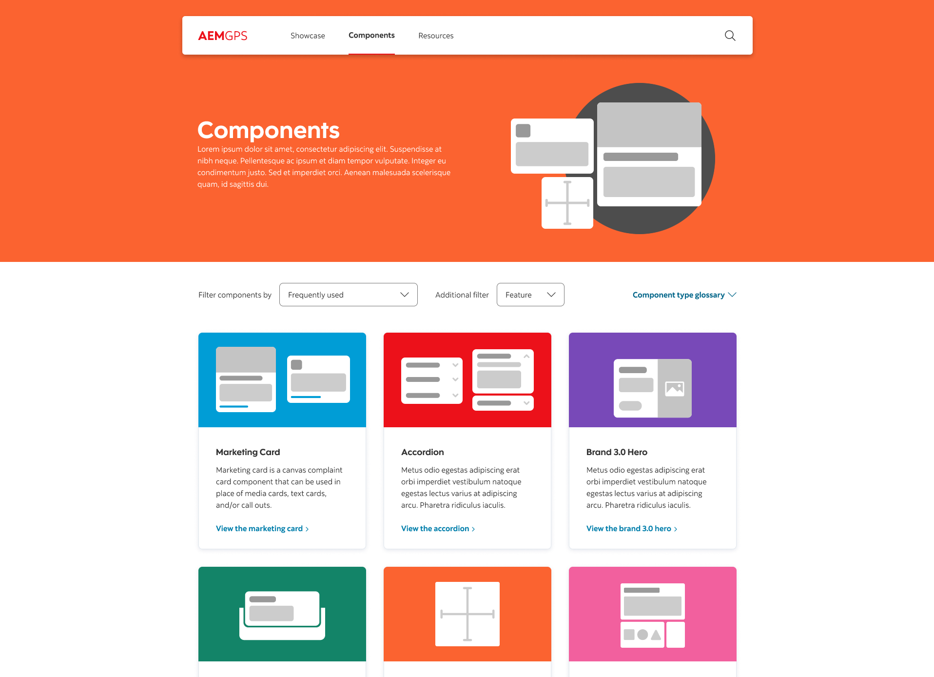
The Solution
Since a designer is not always available to provide one on one design guidance for our authors, we set out to create a page building guide that is easy to follow, and offers documentation that answers any questions an author may have.
The Brief
The importance of user flow, brand consistency and accessibility was a core element during the planning stage of this guide. Often, business lines would request a page and the content author team would get to work. Without clear briefs or guidance, pages were often built without the user in mind. It is of no fault of either the business lines or authors, rather a lack of UX designer to translate business requirements into page designs.
To help alleviate this problem, we designed a brief that outlined clear objectives and requirements that an author could implement with the help of the other key sections of the guide.
Accessibility
Working closely with the accessibility team, we crafted guidelines for colour legibility, layout & taxonomy. It’s important that our pages are not only accessible for all our customers, but the guide itself has to be usable by all. Since this guide and our website share the same CMS, the component and back end systems were already compliant, a huge plus for our authoring team.
Design
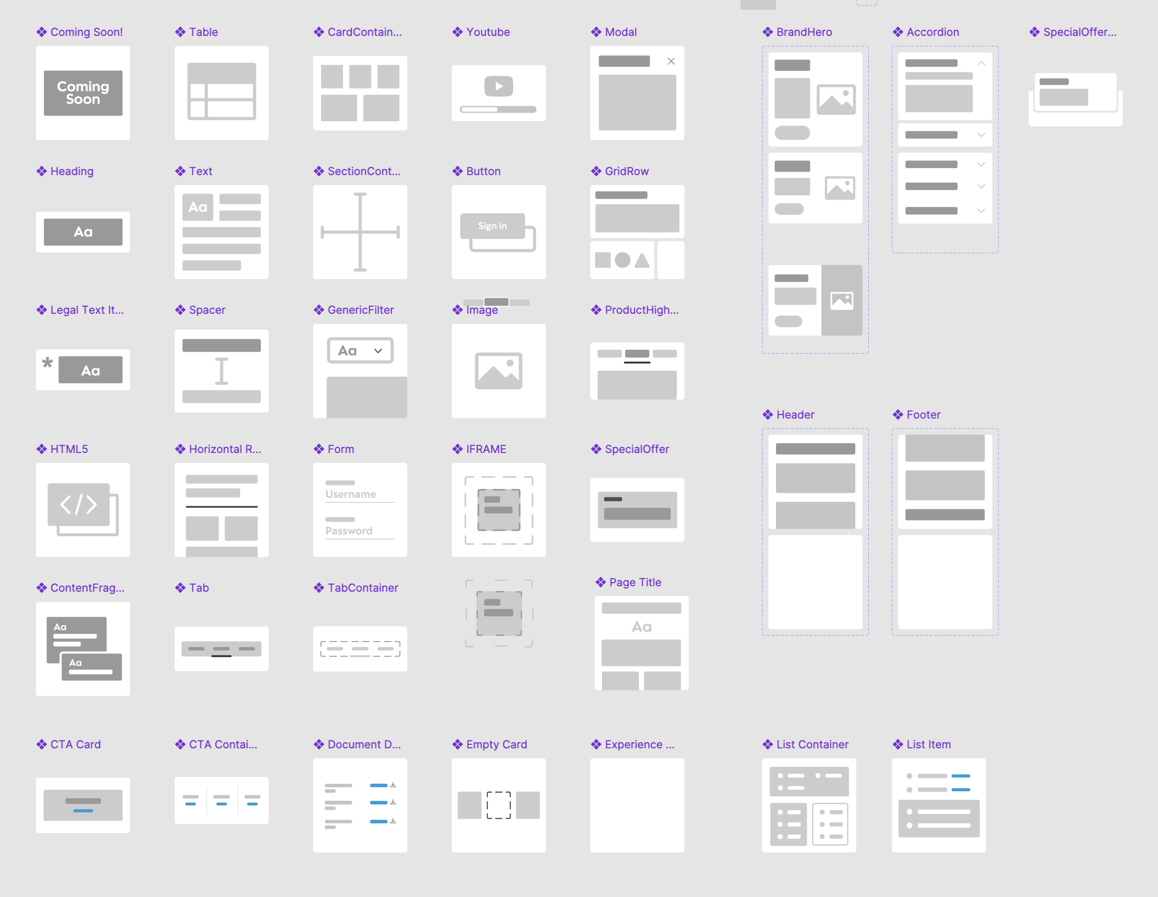
As mentioned above, UX designers such as myself were only involved with the building out of new components or large campaigns. The remaining 2000 or so pages are built by the authoring team.
The design section of the guide laid out requirements for user flow, navigation, breadcrumb usage, banner placement, call to action methods and an overall guide on how to use components to build a full page.
Best Practices ( Overall Page Design )
Finally, we focused on bringing all the component guides together into an overall page building set of requirements. We set out user flows for campaign style pages where several call to actions were present. We also built out best practices for data tables, calculators and other necessary tools for users.
Wrapping it all up
After a successful launch, we found the amount of questions we would get during our weekly design qa meetings would become less frequent, a sign that our new guide was working. The next few weeks brought new component guides online and more overall page design examples.
Project Timeline
6 Months
Online Account Creation
+25%
Call centre call volume
-32%
These types of projects bring to light the importance of good internal tools. We as UX designers prefer to highlight the big showpieces where customers interact and comment , but often forget there is an army of workers who rely on internal tools to make their day to day lives easier and less frustrating. I have luckily worked on several internal projects and often look forward to the impact and comments I receive from my colleagues.